moods - Mood Tag Manager with CLUI
The command musicdb moods runs a command line “GUI” to manage mood-tags.
Every change gets write to the database immediately.
Press Ctrl-D to exit the tag manager.
Moods are tags that are designed to annotate moods and feelings to songs. The implementation is pretty general so that they can be used to annotate any kind of information to a song. Only restriction is, that they can be represented with “one single” (after rendering) Unicode character.
After executing musicdb moods the UI shown on the following screenshot appears:
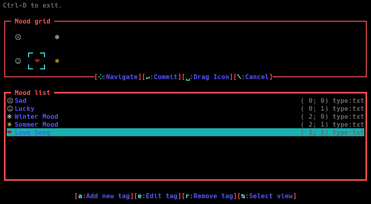
In that form, Mood flags are represented as list (explained in the Mood List section) and as grid (explained in the Mood Grid section). You can switch between those representations using the tab key (↹).
Mood List
The Mood List show all moods in the database. The first column is the icon and color assigned to the mood. Next column is the name of that mood. On the right side are the coordinates of the moods in the Mood Grid and the type of the icon. Currently, only Unicode icons (txt) are implemented.
In the Mood List pane you can add, edit or remove mood tag. When you add or edit a flag, the dialog shown on the next screenshot appears.
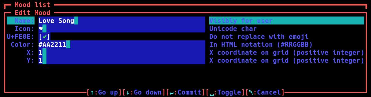
The input forms can be accessed using the arrow keys ↑ and ↓. The inputs have the following meanings:
- Name:
Name of the tag. This will be visible to the user via tool tips. This name should be short but meaningful.
- Icon:
An Unicode icon. This can be any printable Unicode character. It can also be extended with combining characters. This value gets stored as string. As long as it will be rendered as a single character, everything is fine.
- U+FE0E:
If this checkbox is set, the Unicode character VARIATION SELECTOR-15 gets append to the icon. This forces the software that displays the icon (In this case the web browser or shell) to use the text representation of the Unicode character and not replace it with a “fancy” image. Set this flag in case a browser or shell you use does this. The problem with replacing the character by an Image is, that it destroys the color scheme of the Web UI.
- Color:
Here you can specify a color to highlight an Icon. This should only be done in exceptional cases. To color must start with a hash (#) followed by a two hexadecimal number for the red value, then the green value, then blue. For example (“#0080FF”) is 0% red, 50% green and 100% blue. Most color wheels have a HTML color representation. So for choosing a color you can use for example GIMP. Forcing an icon to not follow the color scheme of the Web UI can lead to ugly side effects. Just imagine you have a red heart icon on a red background. The excessive use of explicit colors in the example shown on the screenshot is how not to use this feature ;)
- X/Y:
This is the position in the Mood Grid. Details are explained below. When you add a new Icon, you must give it some initial values. They can be anywhere in the grid where no other icon is. You should not exceed 2 lines (so only
y=0andy=1should be used).
Pressing enter (↵) writes the changes to the database. Pressing escape twice rejects the changes.
Mood Grid
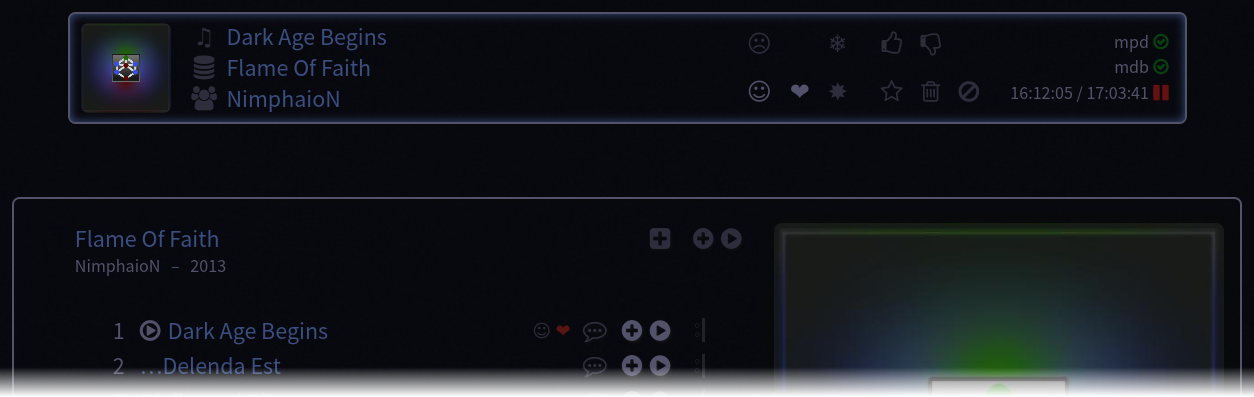
The Mood Grid helps you to arrange the mood tags in a grid. This is the same grid used in the WebUI to show the tags in the HUD as shown on the screenshot below, upper part. Furthermore you can see, that in the WebUI, the color gets not used inside the mood grid in the HUD. When a mood gets assigned to a song, than the icon is visible on the right part of the song entry in the Album View (bottom part of the screenshot). There, the icons color will be used to highlight special flags.
You can use the arrow keys (↑↓←→) to move the rectangle around the icons in the Mood Gird. When pressing space, the rectangle changes to arrows and + signs (See following screenshot) and you can mode the icon itself.
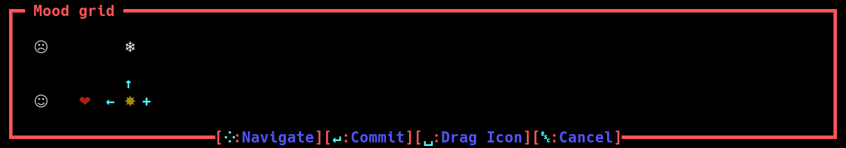
As you can see on the screenshot, you can exchange the positions of the sun with the heart by pressing ← or snow flake by pressing ↑. When you press → a new column gets added to the grid. The sun icon will then be placed in the next column. When there are columns on the left or right that are not used, they get removed automatically. Not each cell of the grid needs to have an icon. Feel free to place the icons to intuitive places.
Style Guide
Only use colors in exceptional cases.
Give meaningful but short names.
Arrange icons to intuitive places.
Do not add too much mood tags. (It should not exceed 8 or 10 max)